Photo Editor
Redesign the kiosk product builder tools, which are used to compose photo books, calendars, cards, and other user customized products.

Project
Overview
As part of the kiosk redesign team, I was tasked with renovating the kiosk product builders. When a user selects a product at the kiosk that can be customized, they are taken to a product builder tool where they can personalize the merchandise by adding their own photos, text, and more.
Problem Statement
The existing product builders are inefficient, unintuitive, and not unified across all products. How do we design one system for building multiple types of products?
Goals
-
Compartmentalize buttons and features by categorizing them into groups.
-
Design a modular and flexible interface using interchangeable elements which can be added or removed as necessary. This also allows room for new features to be added down the road.
-
Design a consistent linear flow by guiding the user through a step by step process
Research
We researched competitor applications and interfaces like Shutterfly, Snapfish, Kodak Moments, CVS, Walgreens, and Mint to see what worked and what didn’t. Then we looked at other sites and apps such as Adobe Spark, Snapchat, TikTok and Nike for trends and creative inspiration.

Sketches & Wireframes
We reviewed our old builders and brainstormed what to keep or remove. Then we started sketching out our ideas.

Early Concepts
Our team met regularly to review our design progress with the kiosk project leadership and generate internal feedback and direction. The design team would then use that feedback to decide on specific actions to take to update the design.

Product Editor Redesign
-
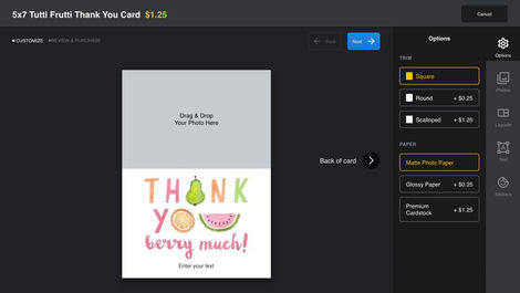
Removed the home, back, cancel order, help guide, and shopping cart buttons. Then replaced them with the name of the product, unit price, and a cancel button. The cancel button takes the user out of the builder and returns the user to the shopping experience flow.
-
Removed the quantity control from the main builder page
-
Replaced the ‘Add to Cart’ button with a ‘Next’ button.
-
Moved the photo tray, change layout, change border, and add text options to a toolbar.
-
Added stickers as a new feature, which made the platform feel familiar to social-media savvy users.
Edit Text Redesign
-
All the text options are on one panel under the text tab, making it easy to find and access.
-
Tapping on a text box will now zoom in to focus, making it easier to see the text while still giving context to where the text box is on the template.
-
Removed the clear text button and replaced it with a red garbage icon.
Transform Redesign
-
Tapping on a photo will bring up the transform controls. The user can rotate, resize, or delete the photo.
-
The blue edit button brings the user to a new screen for editing the photo.
New Features
Prototypes
Conclusion
By designing the system to be modular and flexible, we can easily swap out elements based on the specific products users are creating. This approach also leaves room for future feature additions. The modular design should save developers time when making updates, as they'll only need to modify a single element rather than changing it across each product editor.


